
Data means nothing if you cannot read it. A list of numbers sitting in a notebook or a spreadsheet tells you very little on its own. Put those same numbers into a histogram, and patterns become immediately visible. You can see where values cluster, where they thin out, and whether your data skews in one direction or sits evenly distributed across the range.
Histograms are used in classrooms, research settings, business analysis, and science labs. But finding a template that fits your specific data set is not always straightforward. We put together five free blank histogram templates covering different layouts and use cases, so you can find one that fits your data right away.
Why a Blank Histogram Template Saves Time
A blank histogram template handles all of that structural work upfront. You bring the data. The template brings the framework. All you need to do is decide on your intervals, mark your scale, and start filling in the bars. Whether you are a student working on a statistics assignment, a teacher preparing a class activity, or a professional tracking frequency data at work, a ready-made template removes the setup entirely and lets you focus on the analysis.
If you are also working with visual frequency data and want a more image-based format, these free printable blank pictograph templates give you a simple alternative way to present the same information.
A Look at the Five Templates
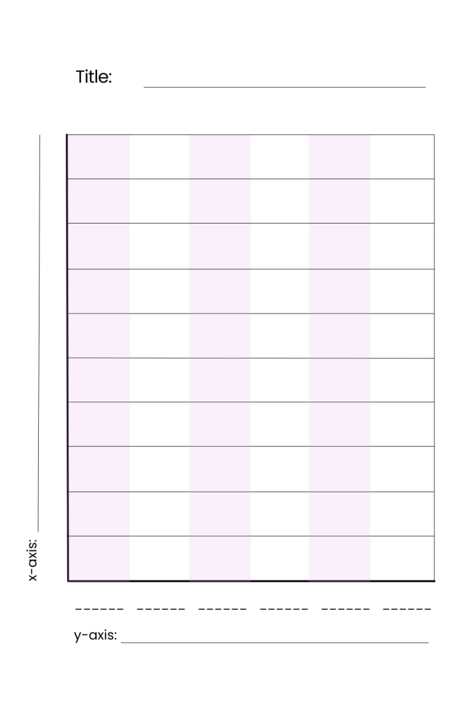
Template 1: Purple Shaded Column Grid with Title and Axis Labels
The first template uses a portrait orientation with alternating purple-shaded columns running vertically across a grid. Six blank label slots sit below the chart for marking interval ranges on the horizontal axis, and a y-axis label line runs along the left side. A title field at the top gives you a place to name your chart.
The alternating column shading makes it easy to track which bar belongs to which interval, which reduces reading errors when the chart gets filled in.
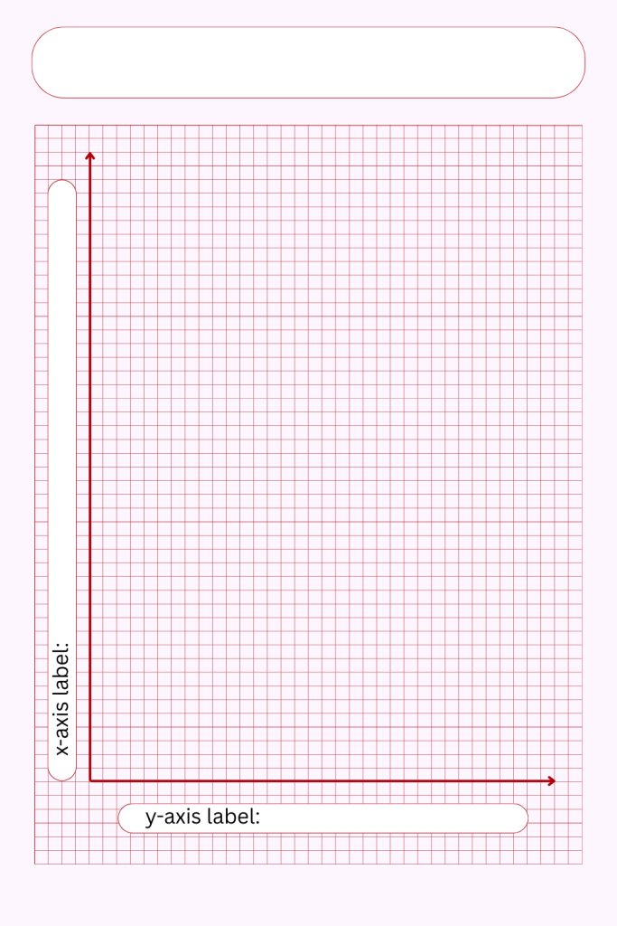
Template 2: Red Grid with Arrow Axes and Rounded Title Box
The second template takes a more precise approach. It features a fine red grid that covers the entire plotting area, with bold red arrows marking the vertical and horizontal axes clearly. A rounded title box sits at the top and label fields are positioned along both axes. The grid lines are close together, giving you a high level of precision when drawing bars.
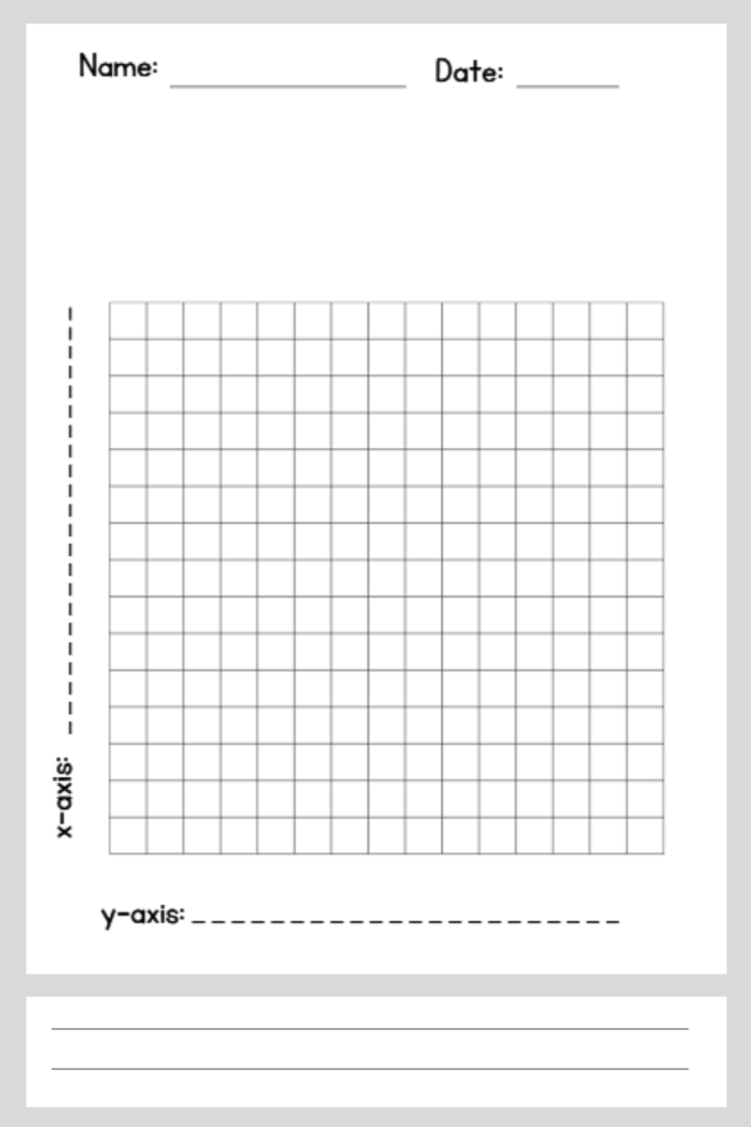
Template 3: Black Grid with Name and Date Fields
The third template is built for classroom and academic use. It includes name and date fields at the top right, which makes it practical for graded assignments and worksheets. The grid is clean black on white with a dashed vertical line marking the y-axis. A notes section with three ruled lines sits at the bottom of the page for recording observations or conclusions.
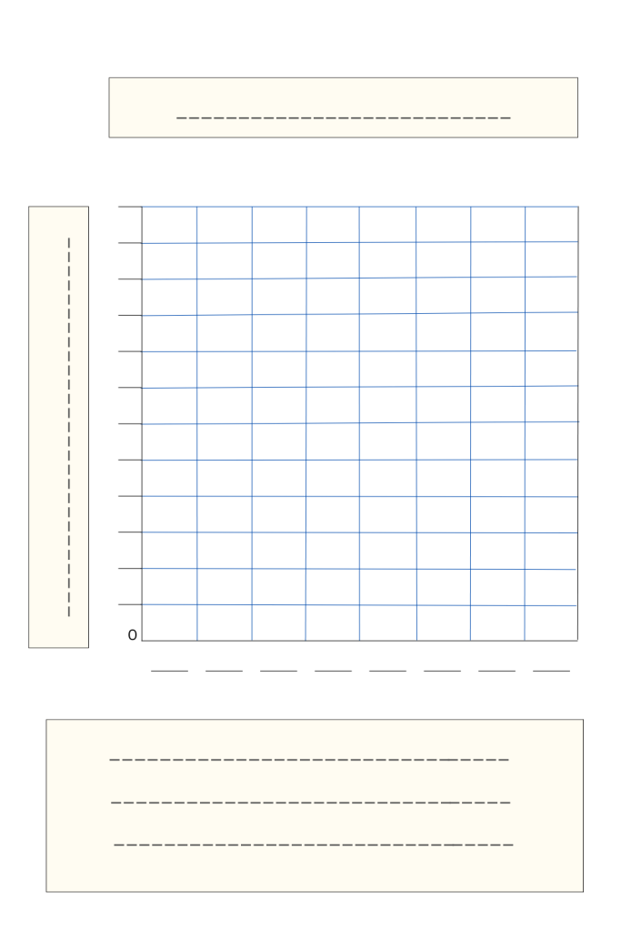
Template 4: Blue Grid with Cream Title and Notes Boxes
The fourth template adds a bit more structure around the chart itself. A cream-colored title box sits above the grid, and a matching notes box with three ruled lines sits below. The notes section at the bottom is what makes this one particularly useful. Having a dedicated space to write down observations right below the chart keeps everything in one place.
Template 5: Blue Axis Arrows on Fine Grid with Four Label Fields
The fifth template is the most open-ended of the set. It features a large fine grid enclosed in a bold black border, with blue arrows marking the vertical and horizontal axes. Four label fields sit above the chart in two rows, giving you space to record the subject, date, class, or any other identifiers relevant to your data set. The zero origin is clearly marked at the bottom left.

How to Use These Templates
All five templates are available as PDF files and print on standard letter-size paper. Before you start drawing, decide on your interval width and figure out the highest frequency value in your data set so you can set your y-axis scale correctly. Write your axis labels and title first, then mark your intervals along the x-axis before drawing any bars.
Use a ruler to draw straight bar edges for a neat final result. If you are using the template for a student assignment, pencil in the bars first and go over them in pen once the values are confirmed. For data that involves three-dimensional plotting or technical drawing alongside your histogram work, these free printable isometric grid graph papers are a useful addition to keep on hand.
Pick the template that matches your data and your setting, download it for free, and start plotting.